Mayawood
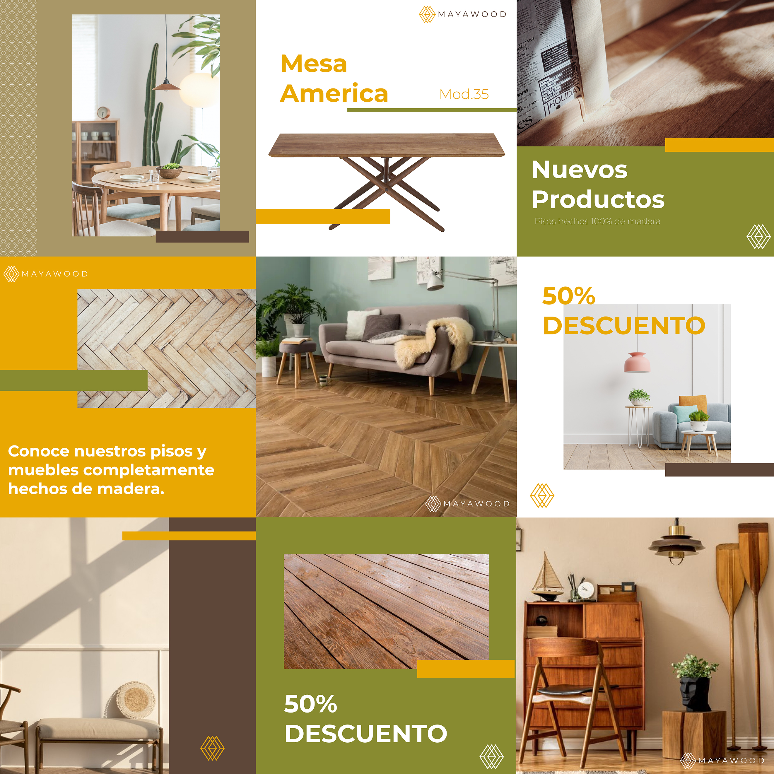
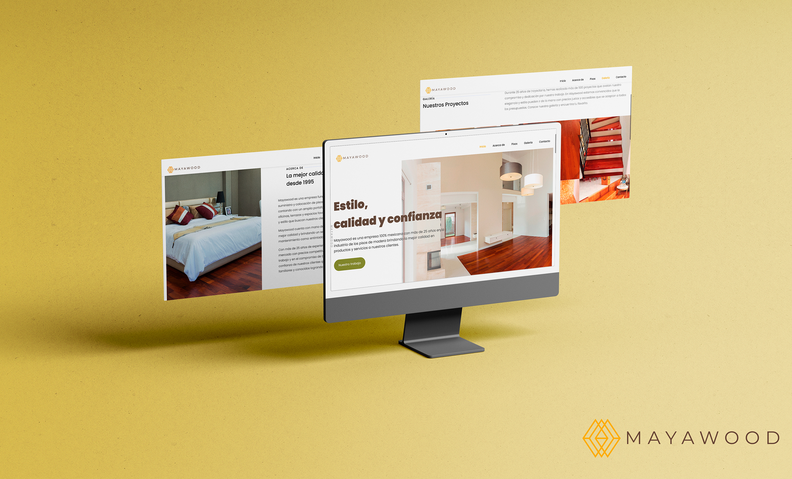
Mayawood is a 100% Mexican company since 1995 dedicated to the manufacture, placement and maintenance of different types of wooden floors in Mexico City and surroundings, In addition to offering other types of products and services closely related to the carpentry. The products and services that Mayawood offers are focused on middle and high-class levels in Mexico, so we wanted to redesign the brand so we can show the quality of the services in order to re-position the brand in the Mexican market.
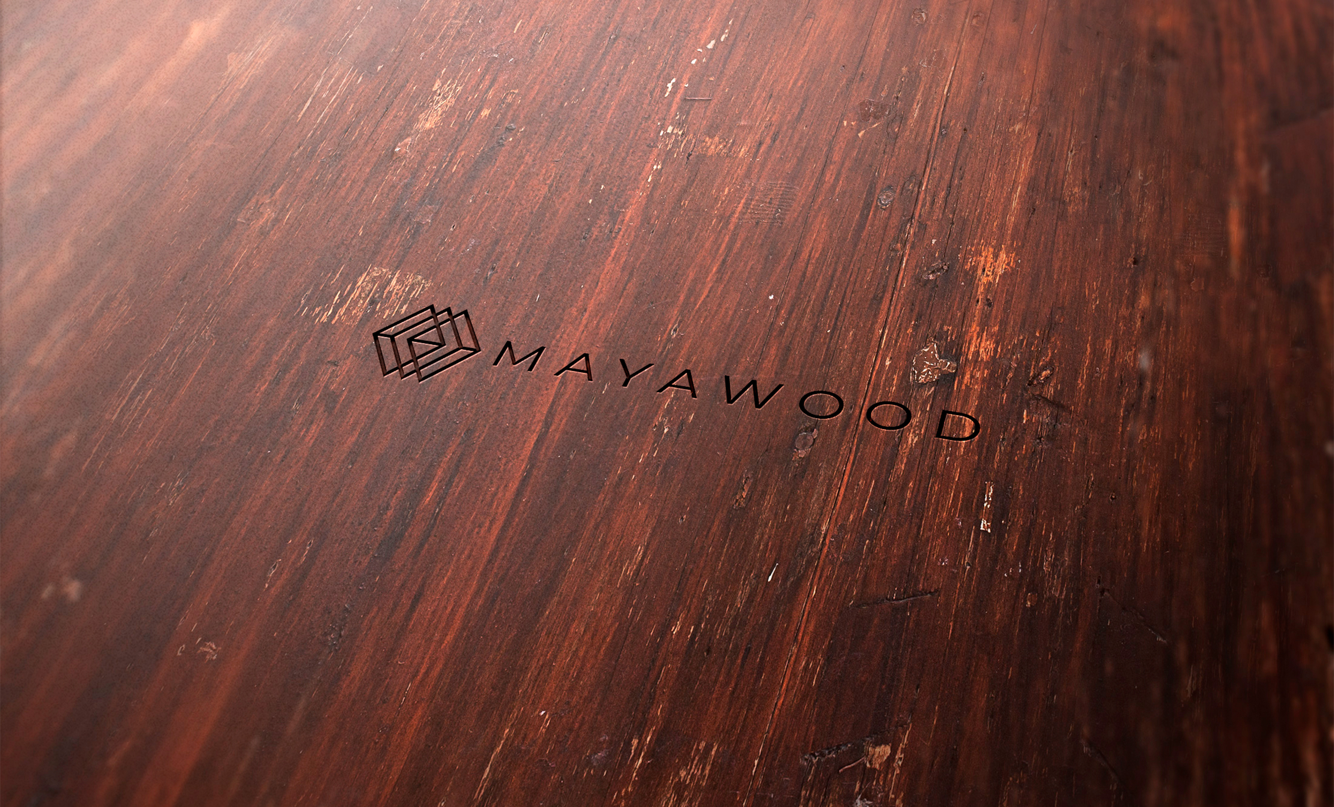
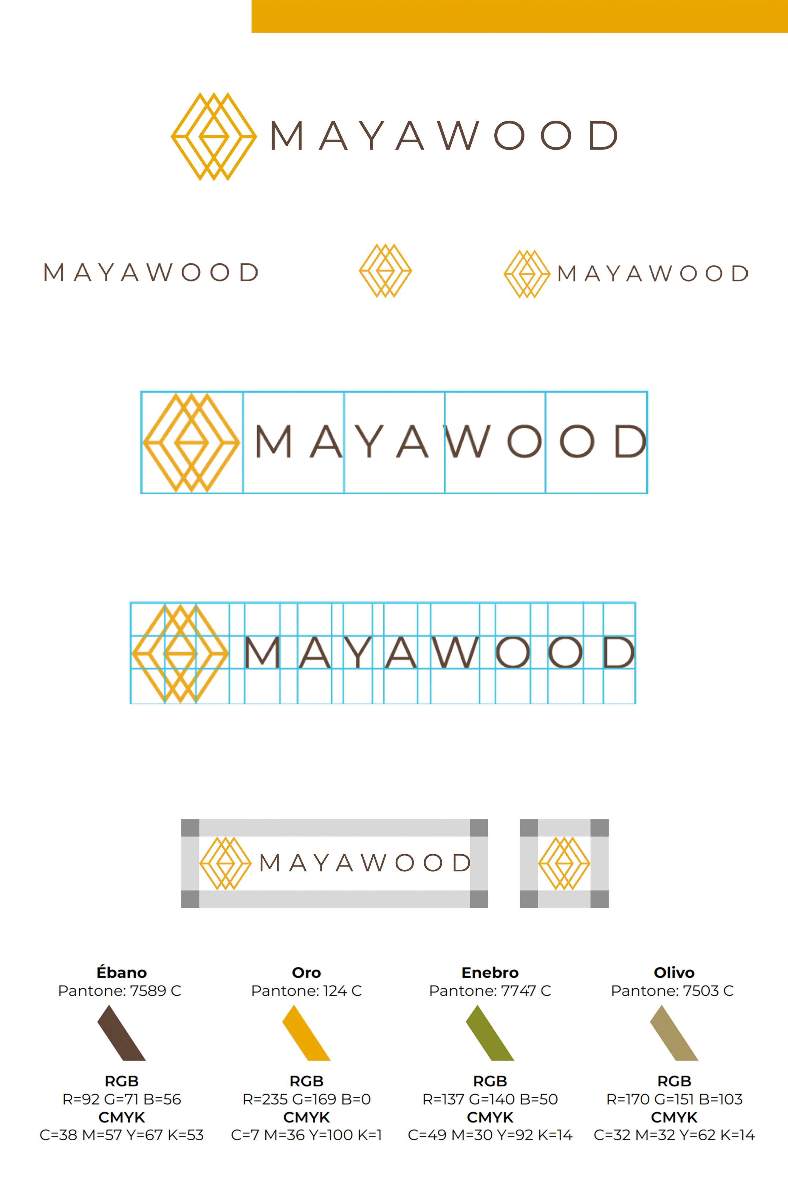
The graphic proposal is focused on retaking the triangular element of the previous logo, turning it into a very subtle and abstract monogram of the M and W of Mayawood, in a geometric - outline graphic style. The typography chosen for the logo responds to a harmony between the monogram and the logo to integrate through its sans-geometric features, so you get a totally fine and contemporary brand that responds to the update we are looking for. A chromatic palette with earth tones is used that create the sensation of a structured, firm and reliable brand, with gold tones for the monogram and ebony for the logo.
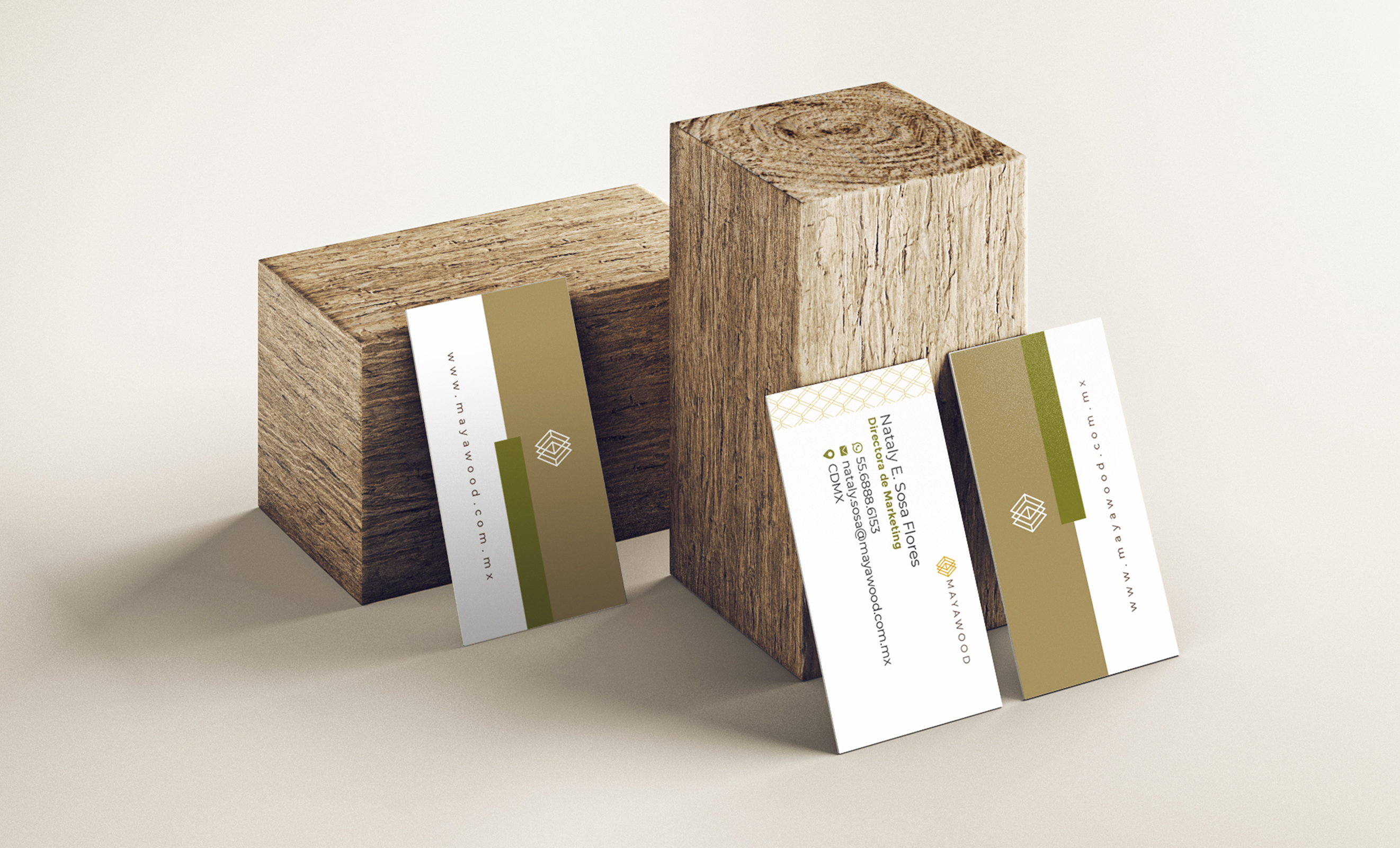
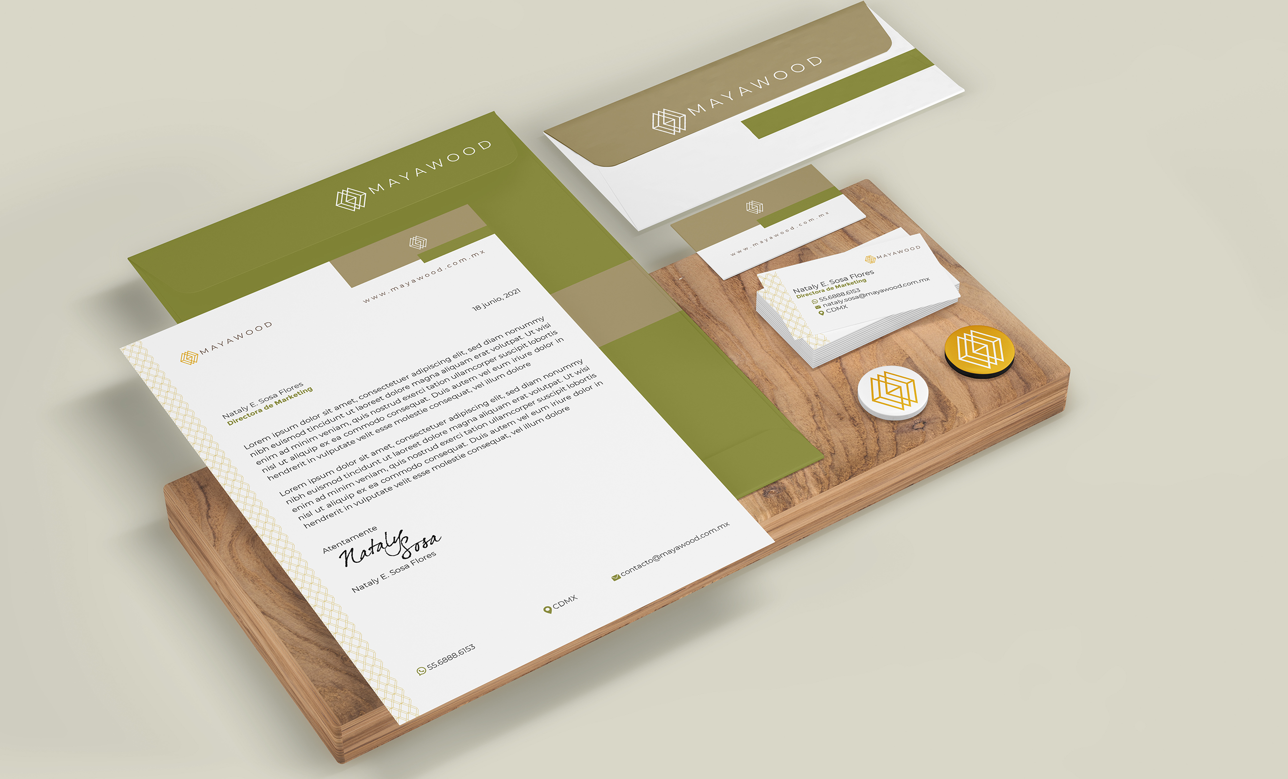
All the applications were designed together with the graphic design team of the Mexican agency Quinto Negro, which include the stationery, the design of the identity manual, email signatures, the look and feel proposal for social media postings and the company website.
For Mayawood, by mauu.design & Quinto Negro
Mexico City, Mexico 2021